Tuesday, May 7, 2013

Bill Clinton's Last photoshoot as president


I stumbled upon this relitivly interesting portrait the other day, taken during Bill Clinton's last official photoshoot as president by 'Platon'. 

Interestingly- this shot was said to be inspired by the Lincoln Memorial, However many people believe that instead the photographer was trying to obviously referencing the Monica Lewinsky scandal. Bob King, when interviewed on  Larry King Live said "The tie is an arrow pointing to his penis, his legs are splayed to present his crotch to us, his hands are big to grope you, and he's smiling in a way to say I got away with it"

To me I'd say this was deliberately done, the angle of the photo, and the focal point were deliberate decisions made by Planton and therefore I would suggest he had his own agenda whilst photographing Clinton. 

This opens up an interesting discussion about a photographer applying their own meaning and beliefs to an image without applying the subject knowing what is happening. Of course- you cannot tell  for sure if it was intended in this case or rather just how it was interpreted by the viewers- either way I find it pretty interesting.  Is it morally okay to portray a person in a particular way (that they would not be okay with) through portraiture? 

It makes me think of how much control we as photographers really have on the way people can be depicted in images.

Analysing an image


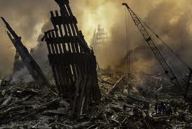
This image was shot on September 12, 2001 by documentary photographer Steve McCurry. It captures the sunrise in the aftermath of the Manhattan terrorist attacks. McCurry talks about this photograph in an interview with the New York Times. He speaks of the security being extremely tight, as you could imagine nobody was allowed in close proximity to the disaster zone. McCurry went down to the site in the early hours of September 12, 2001 and cut a hole in the fence. This allowed him access and he was able to spend the morning documenting the aftermath of September 11, until he was removed by angry police. McCurry commented that when he was removed from the area the police were very hostile as he was seen as a tourist/onlooker however he knew as a documentary photographer he needed to record this moment in time.

I selected this image for the sheer power of documentary photography. This photograph has become an historical document as it captured key elements from an event that changed the world as we knew it. The event resulted in various major conflicts around the world as part of the “War on Terrorism” and changed our awareness of the extent to which terrorism could impact the western world on its home soil.

Documentary photography takes the viewer to a different place, it helps people understand the significance and the aftermath. It is a powerful tool, in this case it allows us to understand the gravity of the situation. It captures the elements that have not been captured by live news.

It is events like this where thousands of people are fleeing the scene , the documentary photographers are trying to get to the heart of the story. They understand the importance of recording moments like these.

The photograph captures the pieces of what once was an iconic landmark. The photograph while depicting a broken building also symbolises the death and destruction that occurred. The colour tone of the photograph creates a very sombre feel, a life and death. The darkness is symbolic of the tragedy and the hundreds of lives lost and the light coming through the debris symbolises after life and the beginnings of hope.

The image has an unfamiliar feel, almost like another planet. It is like it has been shot straight from a war-zone, not on the familiar streets of Manhattan. The human elements standing in the foreground of the photo represent life , you could only imagine the magnitude of emotions they experienced in the clean up operation.

Historians regard photographs as critically important evidence that document past events. Susan Sontag once wrote “Photographed images do not seem to be statements about the world, so much as pieces of it”. I believe that this is the case for the image McCurry shot on September 12 and the title of the work is also testament to this, “pieces of 9/11”.  

Monday, May 6, 2013

Image Analysis- End Times Jill Greenberg


Nearly every photographer will be familiar with Jill Greenberg's famous series "End Times"(2006). These portraits are truly effective and capture a moment incredibly well. Having seen many toddlers throw a tantrum (working in a retail store with candy and toys at child height does this), I believe this series is very aptly named and really does capture the raw emotion children feel so strongly. 
Apparently during the shoot the children were offered candy which was then taken away- producing such a reaction. 

Interestingly her motive behind producing this work was to express her own incredible sense of frustration at the state of polotics at the time. She stated "I love the raw emotion of children, because it comes close to the anger and helplessness I feel about our current political and social situation." She used children as a vehicle to represent this in her exhibition due to their ability to feel and display emotion so strongly and passionately. 

Whilst it's hard to single out any particular image in this series, I chose this particular image as I found it so engaging. Perhaps its the eye contact or the complete look of helplessness on the child's face- but personally I can't look away from her eyes. These images were designed to engage and draw a strong reaction from the viewer, and were actually very controversial when released. Many critics accused Greenberg of abusing and manipulation children just for a photograph. In my opinion I believe this is a slightly strange reaction- given that the children were not harmed in any way, rather just not given candy!

However this does remind me of our discussion in class regarding the exploitation of children- since Greenberg is using these images to push her own political beliefs and frustrations is she really exploiting these children for her own benefit? Probably. But will these children suffer because of it? (excluding being denied candy for a short period of time) I don't think so. 

I adore the over the top stylisation of this image, the lighting is amazing and ads an extra layer of drama to the image, according to my research there would have been roughly 8 lights used in this image, creating such beautiful and controlled highlights. Greenberg also used quite a lot of post processing to complete the image, especially dodging and burning. 

Often what makes a truly special portrait is the emotion shown by the subject. It gives the viewer something to connect with on another level. This is why this portrait series is so successful. The vulnerability and sadness shown in this child's eyes personally makes me want to pick her up and protect her from everything. It instantly turns on every ounce of maternal instinct I posses.

Referances:
http://blogcritics.org/culture/article/exhibit-review-jill-greenbergs-politically-charged/

http://abcnews.go.com/Health/popup?id=2242810

Image Analysis - "Andy Warhol"


Mark Greenberg  “Andy Warhol” (December 1985)


American photographer Mark Greenberg was chosen by German Stern Magazine to photograph Andy Warhol at his factory in New York in 1985. Feeling overwhelmed by the thought of photographing Andy Warhol and how he would make it somewhat interactive, he decided with letting Warhol be involved in the process. He gave Warhol a piece of paper and a marker and asked him to write the word ‘portrait’ on it. An intrigued Warhol had three attempts at writing the word yet scrunched them up until he was happy, and then posed for Greenberg.
This little insight into Warhol’s world is fascinating, as it goes into his obsession with repetition and is interesting as the type is very messy and appears to have been done quickly and in a rush, yet it was the one he was content with.

            In most cases, the photographers’ distinct style or uniqueness about their images is why they are chosen by companies and magazines to photograph an individual; because they will get an image of that specific style and aesthetic. Taking an image of such a strong, influential and intimidating character such as Warhol I imagine would be difficult, and the idea of trying to incorporate the personality of the subjects versus the personality of the photographer is fascinating. The format in which Greenberg chose to display these images was by repeating them and placing them beside each other with a slight differentiation of color in each image. In this, the subject, Warhol, has to some degree made this picture rather than the photographer doing so. This was obviously Greenberg’s initial plan, as in the other image below his concept “was to photograph Andy 36 times, one roll of Black and White film. With each 6 frames, he (Warhol) would rotate his upper body 15 degrees from face on to the camera, to in the last set of 6 full profile”. This form of imitation of Warhol’s work (such as ‘Campbell’s Soup Cans’) is evident and complimentary of Warhol’s significant style and a marvelous tribute from Greenberg.

Greenberg has composed this image to almost mimic Warhol’s many film’s taken in his factory over his career – with the subject standing or sitting directly facing the camera, with a rather large and somewhat harsh light source from overhead. It can be seen as a rather bland and unimaginative image, yet there is something so beautiful and intriguing with the crop off his head, the way his hands are holding the paper angled and very care freely. Most importantly, what separates this image from any other stock image or portrait taken of Warhol over the years is the interesting background. After researching and desperately trying to find out what it is, my best guess is that it is a wall of Warhol’s notorious Factory, as it has a sort of metallic/brushed look. It also could perhaps be a piece of art that either Warhol or one of his gang members had created, as it somehow resembles a roll of film, being repeated and highly polarized on a canvas or something. No matter what the background is, the repetitive nature of the background perfectly compliments Warhol’s artistic career and his fascination of repetition.

            Two years after Greenberg had taken this image, Andy Warhol died in February 1987 from cardiac arrest. To accompany an article in TIME Magazine outlining Warhol’s life and influence on art - especially Pop Art - Greenberg’s image was chosen above all other portraits. The idea that Warhol actively participated in the creation of this portrait, how it reflects his obsession with repetition, and demonstrates Warhol’s uniqueness is fascinating and invites the viewing to question certain aspects of the image (and the entire series of 36 images Greenberg took, for that matter).  These images captured Warhol at a specific moment in time. They present Warhol as vulnerable, the same his subjects normally felt whilst they were posed in front of his camera; being at the complete mercy of the photographer. 


http://bcthemag.com/2011/11/artist-on-artistphotographer-mark-greenberg’s-portraits-of-iconic-pop-artist-andy-warhol/

http://blog.chasejarvis.com/blog/2011/08/many-photographers-one-subject-portraits-andy-warhol/

http://kosmo.hubpages.com/hub/Andy-Warhol-Wanted-to-be-a-Machine

http://www.markgreenbergphotography.com/warhol_the_story.php


Sunday, May 5, 2013

Documentary - Portrait of Domestic Violence

http://lightbox.time.com/2013/02/27/photographer-as-witness-a-portrait-of-domestic-violence/#1


In response to Jeff Harris's 12 year project.

Wow Kate- Great find. I can't imagine the dedication it would take to do that for 12 years of your life.
Such an amazing way to document his story as well. It seems that the project almost forced him to be more active and to try to take the positives out of his heartbreaking situation.

The way I actually got into photography was by deciding to do a 365 day project- so I really do connect with this. Due to study stresses I didn't quite make it but I got to 200 photos. The broad majority of images were awful  but maybe once every 3-4 weeks there would be something I liked.  To this day I think that I learnt the most about photography and myself during that year. I'm sure I wouldn't be in this course now if I hadn't have done it.
Here's a small selection of the images (as embarrassing as they are) - I  wanted to try to not just have an ordinary boring photo of myself everyday and explore myself in the process


Friday, May 3, 2013

Commercial Portraiture

Standard commercial portraits are typically business portraits, family, graduations, weddings and so on, yet I am more interested with the more high end commercial portraits; the expensive world of celebrity branding. 


Celebrity branding and endorsements take form in different ways, which can be a celebrity appearing in advertisements for a product, service or charity, or creating their own line of products or service which bears their name. 

In regards to what Rebecca has previously posted (in particular your Sally Mann post – “unless you photograph what you love, your not going to make good art”) the idea of celebrity branding portraits is quite comical. Although there is an insight into their life – depending on what brand or charity they are endorsing – but does this type of portraiture display expression, personality and the mood of the subject?

Does Beyonce really use a $20 L’Oreal home job dye pack? Does this portrait give an insight into her as a person? Does it capture a moment of time in her life? On a literal level, yes, she would’ve been in a studio modeling for this photograph. But as a portrait, it is simply a celebrity endorsement to make the masses purchase a product based on their loyalty, appeal or desire to look and be like Beyonce or any other celebrity. 

As I want to make a career in the commercial photographic industry, this blog has made me question the reasons I want to do it, or what is appealing about it. Through this discussion, I know that Rebecca, you are so in love with documentary photography and how raw and real it is. This has made me question the authenticity of the commercial practice, and am I just in it for the money?